1.3 Communicating in Biology
Data Presentation
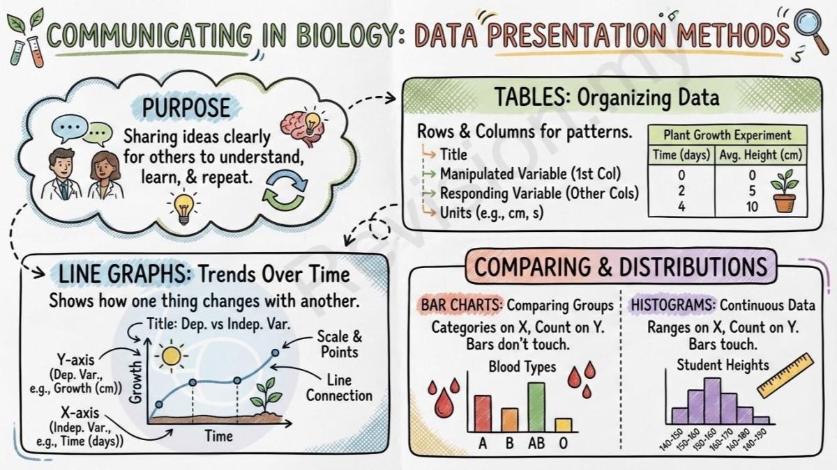
Purpose of Communication: In biology, communication means sharing your ideas and findings clearly with others. This is very important because scientists need to explain what they observed or discovered so other people can understand, learn from, and maybe even repeat the experiment.
Tables: A table helps you organise information in a tidy way. It puts data into rows (going across) and columns (going down) so you can easily compare the results and see patterns.
Table Title: Every table should have a name or title at the top. This title tells you what kind of data is shown in the table.
Columns and Rows: The information in a table is arranged in rows and columns. Each row and each column has a special meaning and helps keep the data neat and easy to read.
Manipulated Variable: This is the thing that you (the experimenter) change on purpose in an experiment. It is usually shown in the first column of a table. It’s also called the independent variable.
Responding Variable: This is the result or change that happens because of what you changed in the experiment. These are called dependent variables and are shown in the other columns.
Units in Tables: Every measurement should include the correct unit so people know what you are measuring (like cm for centimetres, or seconds for time).
Table Example: Imagine a table about plant growth. The first column could say “Time (days)” and the second column could say “Average Height (cm)”. This shows how tall the plant grew over time.
Line Graphs: A line graph is a type of chart that shows how one thing changes as another thing increases. It’s great for showing patterns and trends over time.
Line Graph Axes: The x-axis (the bottom line) usually shows the independent variable. The y-axis (the side line) shows the dependent variable or the results.
Graph Title: Every graph should have a title that tells what the graph is about. It’s usually written as “Dependent variable against Independent variable”.
Axis Labels: The x-axis and y-axis need to have labels that include what you’re measuring and the unit (for example, “Time (days)” or “Height (cm)”).
Scale and Points: Use a proper number scale on your axes so the data points are spaced correctly. Then, put dots or crosses on the graph to show each piece of data.
Line Connection: Once you’ve put the data points on the graph, connect them with a straight or curved line to show the trend.
Graph Example: You might draw a graph showing how a plant’s height changes over time. The x-axis would be “Time (days)” and the y-axis would be “Growth (cm)”.
Bar Charts: A bar chart is used to compare different things or groups. For example, it can show how many people have different blood types.
Bar Features: The bars should all be the same width, and they shouldn’t touch each other because each bar shows a different category.
Bar Chart Axes: The x-axis shows the names of the different categories, like age groups. The y-axis shows how many or how much, like the number of people.
Bar Chart Title: The bar chart should have a title that clearly tells what it is showing.
Bar Chart Example: A bar chart might show the average height of students in different age groups or the number of people with blood types A, B, AB, and O.
Histograms: A histogram looks like a bar chart, but it is used to show data that changes gradually or continuously, like height or weight.
Histogram Bars: The bars in a histogram touch each other to show that the data values go from one group to the next without a gap.
Histogram Axes: The x-axis shows the range of values (like 140–150 cm, 150–160 cm), and the y-axis shows how many people fall into each range.
Histogram Example: You could use a histogram to show how many students fall into different height ranges, such as 140–150 cm, 150–160 cm, etc.
Biological Drawings
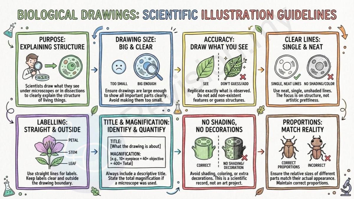
Purpose of Drawings: Scientists often draw what they see under the microscope or in a dissection. These drawings help explain the structure of a living thing or part of it.
Drawing Size: The drawing should be big enough so that all important parts can be seen clearly. Don’t draw it too small.
Accuracy Required: Try to draw exactly what you see. Don’t add anything that wasn’t there or guess what something might look like.
Clear Lines: Use neat, single lines with no colouring or shading. The goal is to show structure, not to make the drawing pretty.
Labelling: Use straight lines to label each part. Write the labels clearly and keep them outside the drawing.
Drawing Title: Every drawing should have a title that says what the drawing is about.
Magnification Indication: If you used a microscope, write how much the image is magnified (for example, 10× eyepiece and 40× objective = 400× total magnification).
No Shading: Don’t use shading, colouring, or extra decorations. This isn’t an art project.
Correct Proportions: The sizes of different parts in the drawing should match how they appear in real life. Don’t make one part too big or too small.
Types of Biological Drawings
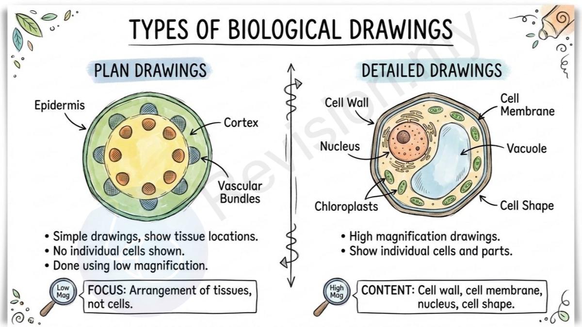
Plan Drawings: These are simple drawings that show where different tissues are in a sample, but they don’t show any cells. They’re done using low magnification.
Plan Drawing Focus: Plan drawings focus on how tissues are arranged in the sample, not on individual cells.
Detailed Drawings: These drawings are made under high magnification to show individual cells and their parts.
Detailed Drawing Content: A detailed drawing might include things like the cell wall, cell membrane, nucleus, and the shape of the cells.
Anatomical Terms
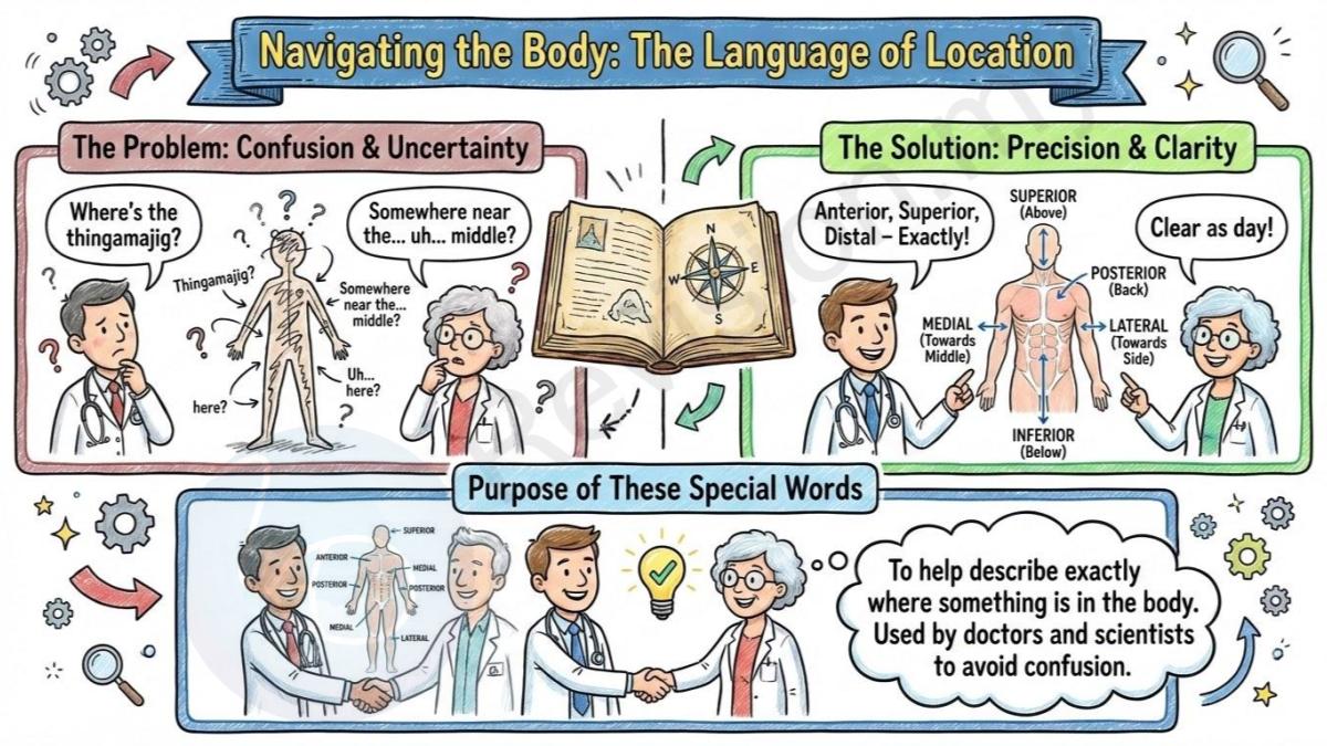
Purpose of Anatomical Terms: These are special words that help describe exactly where something is in the body. Doctors and scientists use these words to avoid confusion.
Planes of the Body
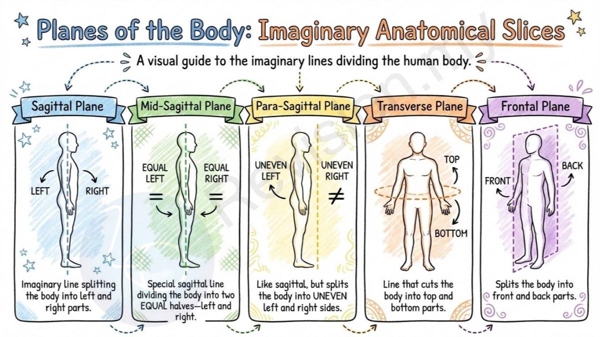
Sagittal Plane: This is an imaginary line that splits the body into left and right parts.
Mid-Sagittal Plane: This special sagittal line divides the body into two equal halves—left and right.
Para-Sagittal Plane: This is like the sagittal plane, but it splits the body into uneven left and right sides.
Transverse Plane: This is a line that cuts the body into top and bottom parts.
Frontal Plane: This plane splits the body into front and back parts.
Anatomical Directions
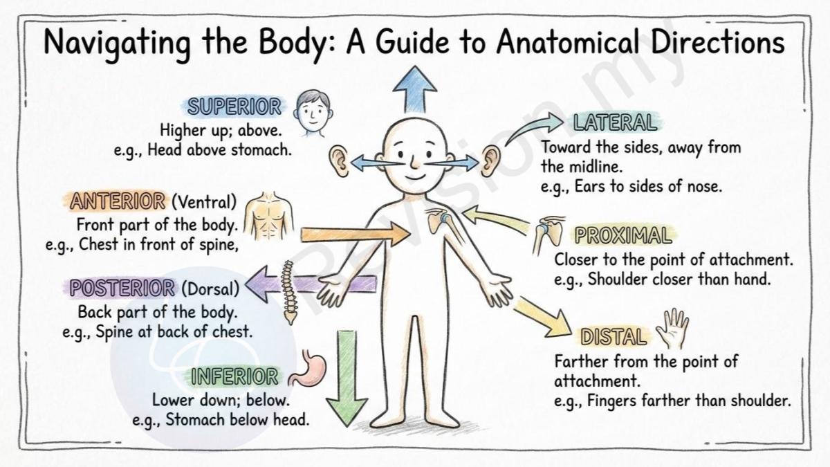
Anterior (Ventral): This means the front part of the body. For example, your chest is in front of your spine.
Posterior (Dorsal): This means the back part of the body. Your spine is at the back of your chest.
Superior: This means a part is higher up. For example, your head is above your stomach.
Inferior: This means a part is lower down. Your stomach is below your head.
Lateral: This means toward the sides of the body. Your ears are to the sides of your nose.
Proximal: This means closer to where a limb connects to the body. Your shoulder is closer to your body than your hand.
Distal: This means farther from where a limb connects to the body. Your fingers are farther from your shoulder than your elbow is.
Anatomical Sections/Cuts
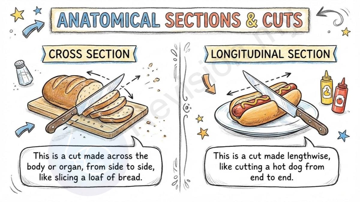
Cross Section: This is a cut made across the body or organ, from side to side, like slicing a loaf of bread.
Longitudinal Section: This is a cut made lengthwise, like cutting a hot dog from end to end.